**I’m now blogging at http://www.ianhopkinson.org.uk/, please adjust your links – this post can be found here**
“The Visual Display of Quantitative Information” by Edward R. Tufte is a classic in the field of data graphics which I’ve been meaning to read for a while, largely because the useful presentation of data in graphic form is a core requirement for a scientist who works with experimental data. This is both for ones own edification, helping to explore data, and also to communicate with an audience.
There’s been something of a resurgence in quantitative data graphics recently with the Gapminder project led by Hans Gosling, and the work of David McCandless and Nathan Yau at FlowingData.
The book itself is quite short but beautifully produced. It starts with a little history on the “data graphic”, by “data graphic” Tufte specifically means a drawing that is intended to transmit data about quantitative information in contrast to a diagram which might be used to illustrate a method or facilitate a calculation. On this definition data graphics developed surprisingly late, during the 18th century. Tufte cites in particular work by William Playfair, who was an engineer and political economist who is credited with the invention of line chart, bar chart and pie chart which he used to illustrate economic data. There appears to have been a fitful appearance of what might have been a data graphic in the 10th century but to be honest it more has the air of a schematic diagram.
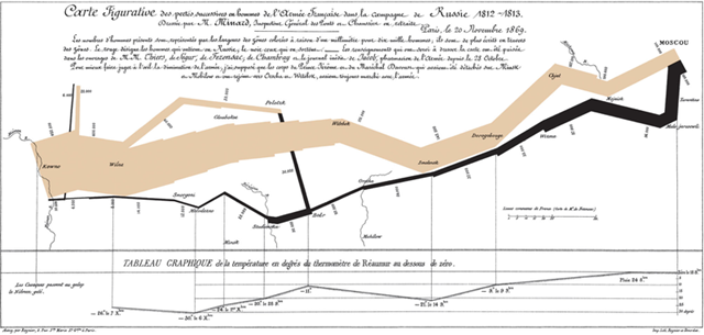
Also referenced are the data maps of Charles Joseph Minard, the example below shows the losses suffered by Napoleon’s army in it’s 1812 Russian campaign. The tan line shows the army’s advance on Moscow, it’s width proportional to the number of men remaining. The black line shows their retreat from Moscow. Along the bottom is a graph showing the temperature of the cold Russian winter at dates along their return.
 Interestingly adding data to maps happened before the advent of the more conventional x-y plot, for example in Edmund Halley’s map of 1686 showing trade winds and monsoons.
Next up is “graphic integrity”: how graphics can be deceptive, this effect is measured using a Lie Factor: the size of the effect shown in graphic divided by the size of the effect in data. Particularly heroic diagrams achieve Lie Factors as large as 59.4. Tufte attributes much of this not to malice but to the division of labour in a news office where graphic designers rather than the owners and explainers of the data are responsible for the design of graphics and tend to go for the aesthetically pleasing designs rather than quantitatively accurate design.
Tufte then introduces his core rules, based around the idea of data-ink – that proportion of the ink on a page which is concerned directly with showing quantitative data:
- Above all else show the data
- Maximize the data-ink ratio
- Erase non-data-ink
- Erase redundant date-ink
- Revise and edit.
A result of this is that some of the elements of graph which you might consider essential, such as the plot axes, are cast aside and replaced by alternatives. For example the dash-dot plot where instead of solid axes dashes are used which show a 1-D projection of the data:

Or the range-frame plot where the axes are truncated at the limits of the data, actually to be fully Tufte the axes labels would be made at the ends of the data range, not to some rounded figure:

Both of these are examples are from Adam Hupp’s etframe library for Python. Another route to making Tufte-approved data graphics is by using the Protovis library which was designed very specifically with Tufte’s ideas in mind.
Tufte describes non-data-ink as “chartjunk”, several things attract his ire – in particular the moiré effect achieved by patterns of closely spaced lines used for filling areas, neither is he fond of gridlines except of the lightest sort. He doesn’t hold with colour or patterning in graphics, preferring shades of grey throughout. His argument against colour is that there is no “natural” sequence of colours which link to quantitative values.
What’s striking is that the styles recommended by Tufte are difficult to achieve with standard Office software, and even for the more advanced graphing software I use the results he seeks are not the out-of-the-box defaults and take a fair bit of arcane fiddling to reach. Not only this, some of his advice contradicts the instructions of learned journals on the production of graphics.
Two further introductions I liked were Chernoff faces which use the human ability to discriminate faces to load a graph with meaning, and sparklines - tiny inline graphics showing how a variable varies in time without any of the usual graphing accoutrements:  - in this case one I borrowed from Joe Gregorio’s BitWorking.
In the end Tufte has given me some interesting ideas on how to present data, in practice I fear his style is a little too austere for my taste.There’s a quote attributed to Blaise Pascal:
I would have written a shorter letter, but I did not have the time.
I suspect the same is true of data graphics.
Footnote
Mrs SomeBeans has been referring to Tufte as Tufty, who UK readers of a certain age will remember well.


