This calculation is based on a calculation of personal tax rates from wikipedia, this figure generates the tax rates programmatically and I simply translated the code to my computer language of choice – I thought about doing it in a spreadsheet but that turned out to be a bit brainbending. The second component of the calculation is the number of people in each income bracket: this information along with further information on incomes can also be found on wikipedia. Ultimately the data come from the HMRC. I’ve put these two bits of data together into a program which enables me to fiddle with tax rates, tax thresholds and so forth. It appears to be approximately correct since it matches roughly HMRC’s own figures on the effects of small perturbations to the tax system (pdf). This also tells you it’s possible to look this stuff up – but I find it more fun to calculate it myself! It’s also a good illustration of the general process of how to go about repeating someones calculations from literature sources: try to reproduce their graphs; try to match the summary numbers they produce.
This first figure shows the income and national insurance payable as a fraction of gross (total) pay as a function of pay. The thing I hadn’t appreciated intuitively is that the tax banding system gives quite a smooth increase in percentage tax take, this is because you only pay raised rates on the fraction of your income that lies above the threshold:

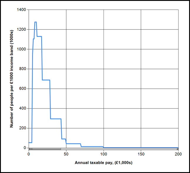
Extending the horizontal scale out towards incomes of £1,000,000 and the rate tends to 50%. The next figure shows the distribution of incomes, in the UK:

You can see the same information in text form here. The area under this curve between points on the horizontal axis tells you the number of people in an income band. The median income in the UK is £26k per annum – half the population earn more than this, half less. About 1% of the population earns more than about £100k per annum. This final figure shows the amount that each income band pays according to the latest tax rates.

To summarise this final figure in tax bands, the 20% band accounts for about 57% of tax paid, the 40% band for 26% and the 50% band for 17%. These bands contain respectively 90%, 9% and 1% of the income tax paying population.
In case you’re curious my salary puts me close to the top of the basic rate tax band.
To apply the knowledge embedded in these graphs to some recent problems:
As a rule of thumb: 1p on basic gives about £4bn, 1p on upper rate gives £0.75bn, 1p on the new 50% band gives £0.31bn. The reason for this sharpish dropoff is that relatively few people are effected by the upper rate tax changes so to yield a large tax income the rates have to be changed by a relatively large amount.
Reducing the threshold of the 40% tax band to £40k from £43k yields about £3bn.
The £20billion cut in welfare benefits is equivalent to approximately 5p on the basic rate of income tax, taking it to 24.5% from 20%. This would cost me about £1700 per year.
Tuition fees cost about £7.5billion (based on 1.5 million students each requiring an average £5k tuition fees per year), this is about 2p on basic rate. This would cost me about £800 per year.
The £2.5billion income gained from cutting child benefit from those in the upper tax band could be paid for with an increase in the upper rate to ~43% from 40%. Although it seems the £2.5billion figure is dubious. I can’t help thinking simply increasing the upper rate by this amount, rather than a convoluted attempt at clawback would be simpler. This isn’t to say I support the idea of paying child benefit to all regardless of income, just that implementing withdrawal in this way is technically complicated. This tax rise wouldn’t cost me anything!
I’ve not seen anybody volunteering for these tax increases to support their favoured causes, rather they prefer a range of schemes of dubious value impacting other people to avoid the problem falling upon themselves – a subject for my next post.
Note
This modelling was done using Visual C# running under Windows 7, if you’re interested either in the code or in just the application then let me know in the comments below (or on twitter). There are a couple of minor bits of tidying I’d like to do before release. Please note that the application is “good enough for blogging work” and should not be considered an accurate tool for tax calculations – it’s a toy to help me understand things!
No comments:
Post a Comment
I've switched commenting off to encourage you to go to my new blog at:
www.ianhopkinson.org.uk
Note: Only a member of this blog may post a comment.